Website accessibility audit: Riverbend Community Supports
Download this report as a PDF (360 KB)
Testing and remediation guidance, not legal advice or a compliance guarantee. This report records what we found on the pages and tasks listed, on the dates listed. It doesn't say the site meets any law or standard, and it doesn't cover pages we didn't test.
1. Summary
We tested the home page, the NDIS services page, the "Make a referral" form, the donation page and the contact page, on a desktop screen and a phone-sized screen.
We found 9 issues across 8 WCAG 2.2 criteria.
| Priority | Count | What it means |
|---|---|---|
| Fix first | 3 | Stops some people completing a task. |
| Fix soon | 4 | Makes a task noticeably harder. |
| Tidy up | 2 | Real, but lower impact. |
The three things to fix first:
- The referral form's fields have no labels, so screen reader users hear "edit text" with no idea what to type.
- The main menu can't be opened with a keyboard, so keyboard users can't reach most of the site.
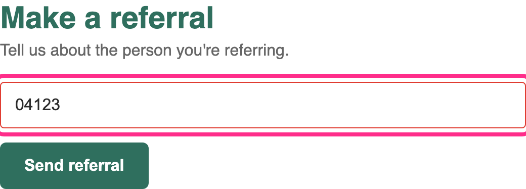
- Form errors are shown only in red text, and aren't announced, so some people can't tell why the form won't send.
2. Scope and method
| # | Page or task | Why it's in scope |
|---|---|---|
| 1 | Home page | Most visited; carries the site header, menu and footer. |
| 2 | NDIS services | Where participants and families compare supports. |
| 3 | Make a referral (form, up to the submit step) | The key task for new participants. |
| 4 | Donate | Main fundraising task (the payment step runs on a third-party platform and wasn't tested). |
| 5 | Contact us | General enquiries. |
How we tested: keyboard only (no mouse); NVDA with Firefox on Windows and VoiceOver with Safari on macOS and iOS; zoom to 200% and 400%; colour contrast measurement; an automated scan with axe-core at 1280 px and 390 px wide. No forms were submitted.
3. Issues
1. Referral form fields have no labels
Fix first WCAG 1.3.1 Info and Relationships (A), 3.3.2 Labels or Instructions (A), 4.1.2 Name, Role, Value (A)
Where: Make a referral, all 7 text fields.
Who it affects: screen reader users hear "edit text, blank" for every field. People using voice control can't say the field's name to move to it. The grey placeholder text also disappears as soon as someone starts typing, which is hard for people with memory or attention difficulties.
How to check it yourself: click on the words "First name" above the first field. With a proper label, the cursor jumps into the field. Here nothing happens.
How to fix it: give each field a visible <label> linked by for and id, and keep the placeholder only for examples.
<!-- before -->
<input type="text" placeholder="First name">

<!-- after -->
<label for="first-name">First name</label>
<input type="text" id="first-name" name="first-name" autocomplete="given-name">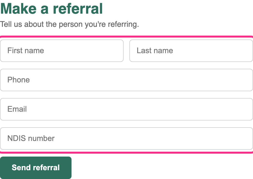
2. The main menu can't be opened with a keyboard
Fix first WCAG 2.1.1 Keyboard (A), 4.1.2 Name, Role, Value (A)
Where: site header, every page (counted once).
Who it affects: people who can't use a mouse, including many people with motor disability, and screen reader users. The "Services" and "About" sub-menus open only on mouse hover, so keyboard users can't reach 14 of the site's pages from the menu.
How to check it yourself: press Tab from the top of the page. Focus lands on "Services" but pressing Enter or Space does nothing.
How to fix it: make each top-level item a real <button> that toggles its sub-menu and reports whether it's open.
<button aria-expanded="false" aria-controls="menu-services">Services</button>
<ul id="menu-services" hidden> … </ul>
If your theme comes from a vendor, send them this issue: fixing the header template fixes every page.
3. Form errors are only shown in red and aren't announced
Fix first WCAG 1.4.1 Use of Color (A), 3.3.1 Error Identification (A), 4.1.3 Status Messages (AA)
Where: Make a referral, and Contact us.
Who it affects: people with colour blindness can't see which field is wrong; screen reader users get no message at all and the form just doesn't send.
How to fix it: write the error in words next to the field ("Enter a phone number, for example 0412 345 678"), link it with aria-describedby, and move focus to a summary of errors at the top of the form when it's submitted.
4. The "Donate now" button text is hard to read
Fix soon WCAG 1.4.3 Contrast (Minimum) (AA)
Where: header button, every page, and the Donate page.
Who it affects: people with low vision, and anyone reading on a phone outdoors.
What we measured: white text on light orange (#F5A25D): contrast ratio 2.1:1. The minimum for text this size is 4.5:1.
How to fix it: darken the button to #B45309 (5.0:1 with white text) or use dark text on the current orange.
5. You can't see where you are when using a keyboard
Fix soon WCAG 2.4.7 Focus Visible (AA)
Where: links and buttons on every page. The theme removes the browser's focus outline (outline: none).
How to fix it: remove that rule and add a clear focus style:
a:focus-visible, button:focus-visible, input:focus-visible {
  outline: 3px solid #1d4ed8;
  outline-offset: 2px;
}
6. Social media icons have no names
Fix soon WCAG 2.4.4 Link Purpose (A), 4.1.2 Name, Role, Value (A)
Where: footer, every page. Screen readers announce "link" four times with nothing else.
How to fix it: add a text name to each link, for example aria-label="Riverbend on Facebook", and hide the icon itself with aria-hidden="true".
7. The services page cuts off text at 400% zoom
Fix soon WCAG 1.4.10 Reflow (AA)
Where: NDIS services, the "Our supports" cards. At 400% zoom (or on a narrow phone) the card text is cut off and can't be scrolled to.
How to fix it: remove the fixed height on .support-card so the cards grow with their text.
8. Decorative images are read out
Tidy up WCAG 1.1.1 Non-text Content (A)
Where: home page. Screen readers read file names such as "hero-banner-final-v2 dot jpg".
How to fix it: give purely decorative images an empty alt=""; give meaningful photos a short description.
9. Heading levels skip
Tidy up WCAG 1.3.1 Info and Relationships (A)
Where: NDIS services jumps from a level 1 heading to level 4. Screen reader users who move by headings can miss sections.
How to fix it: use heading levels in order (h1, then h2, then h3), and style them with CSS instead of picking a level for its size.
4. What's working well
- Every page has a unique, descriptive title.
- Body text contrast is good throughout.
- The contact page lists phone, email, a postal address and the National Relay Service, so people can choose how to get in touch.
- Videos on the home page have accurate captions.
5. Suggested next steps
- Fix issues 1 to 3 first, starting with the referral form.
- Send issues 2, 4, 5 and 6 to your website vendor: they're in the shared header and footer, so one fix covers every page.
- Ask for your retest (included) once the "Fix first" items are done.
- Publish an accessibility statement that says what you've tested, what you're fixing and how people can report a problem.
We don't recommend accessibility overlay or widget products. They don't fix the underlying code, and many people who rely on assistive technology find they get in the way.
Appendix: criteria checklist (extract)
A real report lists every WCAG 2.2 A and AA criterion. A few rows as an example:
| Criterion | Level | Result |
|---|---|---|
| 1.1.1 Non-text Content | A | Issue found (8) |
| 1.4.3 Contrast (Minimum) | AA | Issue found (4) |
| 2.1.1 Keyboard | A | Issue found (2) |
| 2.4.2 Page Titled | A | Pass |
| 2.5.8 Target Size (Minimum) | AA | Pass |
| 3.3.8 Accessible Authentication (Minimum) | AA | Not applicable (no log-in on pages tested) |